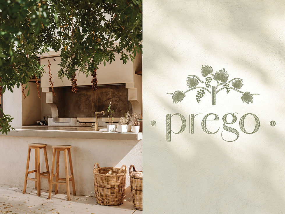
PREGO RESTAURANT

This student project involved creating an illustration-led brand identity for a new Italian restaurant chain aiming to capture the hearts of experience-driven diners. The brief called for a logo, five illustrations, and a large-scale mural, all designed to transport audiences to a sun-soaked Mediterranean escape. My goal was to celebrate the sensory richness of Italian food and culture - ripe grapes, warm textures, and golden light - while crafting an identity that felt authentic, relaxed, and just a touch glamorous.
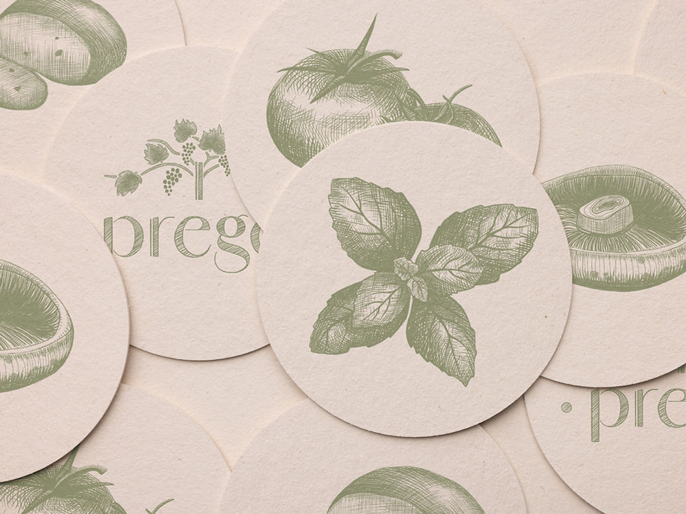
To differentiate Prego from fast-food chains and overly formal establishments, I developed a brand aesthetic that sat confidently in between: approachable yet elegant. My designs used a hand-drawn, pen-and-ink style that conveyed texture and warmth, with illustrations of traditional Italian ingredients and Mediterranean-inspired colours such as grape and olive. Complementary assets drew on mid-20th-century Italian travel posters, using vintage type, blocked colour, and mustard accents.This post-war style exudes a sense of freedom and potential that resonates with the target audience while simultaneously evoking Italian culture.
The result was a series of illustrations that not only promised authentic Italian dining but also the experience of cultural escape. By combining rustic illustration with vintage poster-inspired artworks, I created a versatile brand identity that balances simplicity and sophistication.